
Visualising Election Results with Figma: A Journey Through 2014, 2019, and 2024
- Tanya Sharma
- Jul 5, 2024
- 2 min read
I embarked on a project to visualize the election results of 2014, 2019, and 2024 using Figma. This blog will take you through my process, the tools I used, and the insights I gained from this exciting project.
Why Figma?
Figma is a powerful design tool known for its real-time collaboration and intuitive interface design, making it ideal for creating interactive data visualizations.
Here’s why I choose Figma for this project:
Ease of Use: Figma's user-friendly interface caters to both beginners and experts.
Collaboration: Real-time collaboration with team members ensures a smooth workflow.
Interactive Prototypes: Figma allows the creation of interactive prototypes, enhancing data visualization engagement.

Step-by-Step Process
1. Data Collection
The first step was gathering election results data for 2014, 2019, and 2024 from reputable election databases and official government websites. The data included details like voter turnout, party performance, and regional results.
2. Data Cleaning and Preparation
Using tools like Excel and Python, I cleaned and organised the data to ensure accuracy. This step involved removing duplicates, filling in missing values, and normalising the data for consistency.
3. Designing the Layout
With the data prepared, I moved on to Figma. I started by sketching out the layout to best present the information. Here’s a breakdown of the layout components:
Introduction Screen: A brief overview of the election years and key highlights.
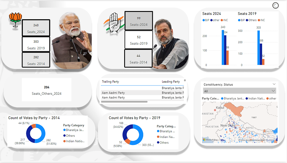
Year-wise Comparison: A section to compare the election results of 2014, 2019, and 2024.
Regional Analysis: Detailed maps showing regional performance and voter turnout.
Party Performance: Charts and graphs depicting how different parties performed across the years.

4. Creating Interactive Elements
Figma’s interactive prototypes allowed me to add elements such as:
Hover Effects: Displaying detailed information when hovering over specific regions or data points.
Clickable Tabs: Allowing users to switch between different years and views seamlessly.
Animations: Adding subtle animations to make the data presentation more engaging.
5. Adding Visual Appeal
To make the visualisation aesthetically pleasing, I focused on design principles like color theory, typography, and spacing. A consistent colour palette was used to differentiate between parties and election years. Typography was chosen for readability and visual hierarchy, ensuring the most important information stood out.
Insights and Learnings
This project was about more than just visualising data; it was about understanding the narrative behind the numbers. Key insights included:
Historical Trends: Analysing the data across three election cycles revealed significant trends in voter behaviour and party performance.
Regional Dynamics: The regional analysis highlighted how different areas of the country evolved politically over the years.
User Engagement: The interactive elements made the data more accessible and engaging for users, enhancing their understanding of complex information.
Conclusion
Using Figma to visualize the election results of 2014, 2019, and 2024 was an enriching experience. It honed my design and data visualization skills and deepened my understanding of the political landscape. Figma’s powerful features allowed me to create an interactive and visually appealing presentation that brought the data to life.
link of project - Election results
Note: The dataset may vary from the original results as it is sourced from Kaggle.
コメント